
Make it simple, stupid.
How do you take the complicated and turn it into something clear?

A company I’ve long admired is Hulsbosch.
Founded by Hans Hulsbosch, it has been responsible for many high-profile rebrands, including the Qantas "Flying Kangaroo," Football Australia, Virgin Australia and Rebel Sport.
You may not have heard of them but if you live in Australia you’ve almost certainly seen their work.

Their rebrand of Woolworths is - in my opinion - their most compelling work.
The ambition was to visually represent the tagline "The Fresh Food People," and the simplicity to get the final design to an apple and the letter ‘W’ is sublime.
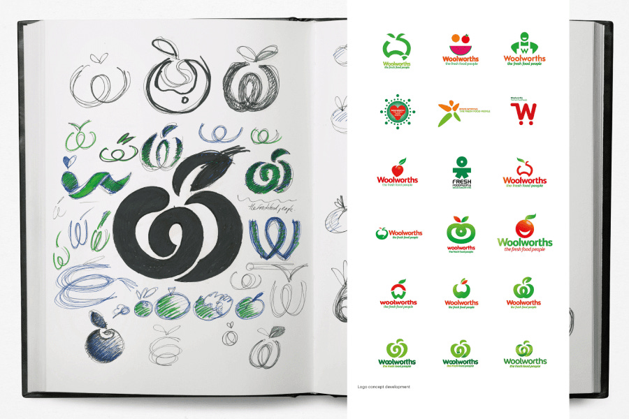
Every single person who looks at that gets it. It’s an apple (symbolising fresh), the colour green (also for freshness + it’s ownable against their biggest competitor who uses predominantly red) and the shape of the W for Woolworths communicates the question and the answer in the one moment. “Who’s the Fresh Food people? Answer: Woolworths.”
How beautifully simple.
However, as Steve Jobs said “Simple can be harder than complex: You have to work hard to get your thinking clean to make it simple. But it’s worth it in the end because once you get there, you can move mountains.”
Inspired by Hulsbosch, here are 3 ways to make your written or visual communication more simple.
